Conscient
Well-Being
Conscient Well-Being is a person-centred therapist, hypnotherapist and self-help coach.
The problem? They felt their current branding was too Generic, and didn't accurately reflect them or their methods.
Year: 2024
Client: Léo Taylor, Conscient Well-Being
About the Project
-
Léo was launching a brand new Counselling and Therapy business, and wanted a personal and professional looking brand image that encompassed their principles and history.
-
To design a logo and visual identity that reflects Conscient’s core principles in their counselling, incorporating assets such as the Hero’s Journey and The Sobriero Tree. The overall goal was to increase brand recognition and customer engagement.
-
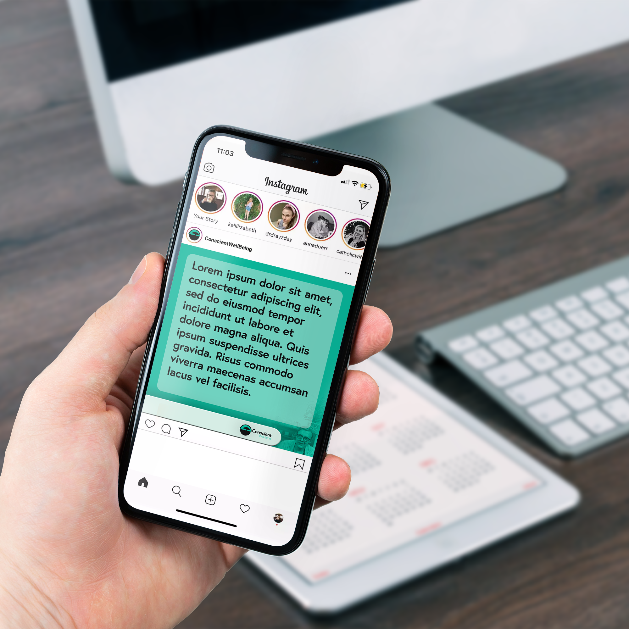
Conscient’s logo combines the tree and the Hero’s Journey into a unique glyph that emphasises the unseen roots of the tree while giving a gentle and nurturing image to the practice.
The new colour scheme of Teal and Black is stark and clear, but still gentle and natural, while sticking out from the health crowd which often uses reds and whites. -
Since working with me, Conscient has been able to expand into a corporate Therapeutics business, bringing on higher quality and higher budget clients who are wowed by their professional look.
-
From this project, I learned that the client’s personal history is just as important as the business’s values. They are just as much a part of the business as anything else.